
Overview
Motor Mind is a desktop platform that brings every aspect of car ownership together in one place, helping drivers stay organised with reminders, maintenance tracking and a clear overview of their vehicle.
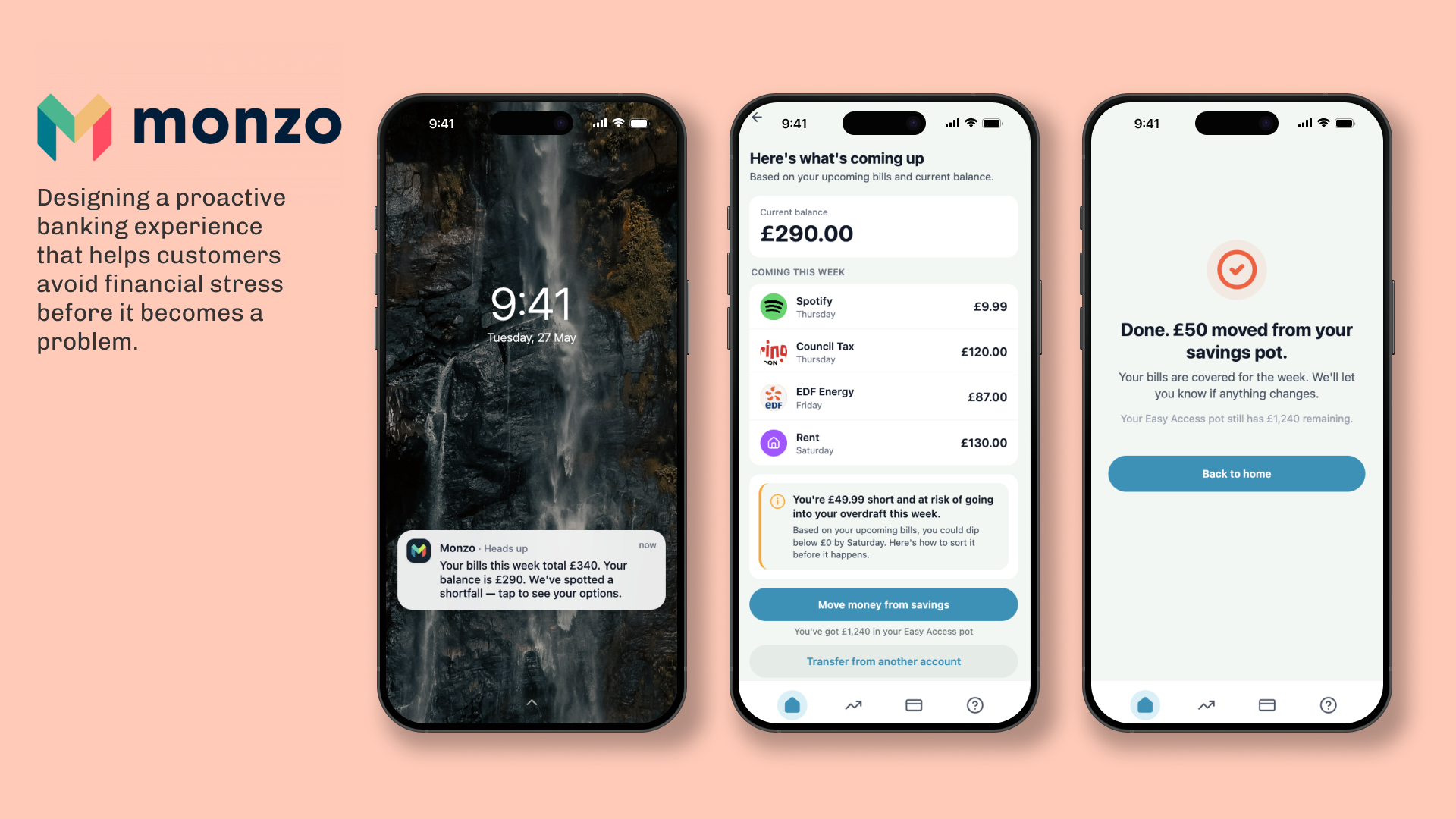
Designed during the Experience Haus x Figma Make two-hour hackathon, this collaborative sprint explored how AI-first design could help banks anticipate customer needs rather than simply react to them, making retail banking feel more human.
Figma Make was used to generate and iterate the prototype in real time, allowing us to move from concept to interactive screens within the two-hour sprint.
My role
Product Designer, collaborating with two other designers across research, problem framing, prototyping and presentation
Methods
Secondary research · Problem framing · UX strategy · AI-assisted prototyping
Tools
Figma Make · Figma Slides · Claude · ChatGPT · Pen + paper
The problem
Car ownership comes with a surprising amount of admin, and there isn’t a single place that helps people manage their entire car ownership journey.
From MOTs and insurance renewals to servicing, road tax and parking permits, important information is often spread across emails, paper documents and multiple websites. Managing a car isn’t difficult because the tasks themselves are complicated—it’s difficult because they’re fragmented.
Drivers need to remember multiple annual deadlines, store important documents, keep track of maintenance history and understand how much their vehicle is really costing them. Missing just one deadline can lead to unnecessary stress, fines or expensive repairs.
THE SOLUTION
A proactive money intelligence feature that surfaces risks before they become problems.
USER PERSONA
Customers want their bank to anticipate problems, not just respond to them.
How Might We?
How might we create one central hub that helps drivers stay organised throughout the lifetime of owning a vehicle?
USER JOURNEY
From reactive to proactive.
Mapping the end-to-end experience to understand how the user journey could evolve:
Current state
Future state
Design DEcisions
Designing for clarity rather than alarm.
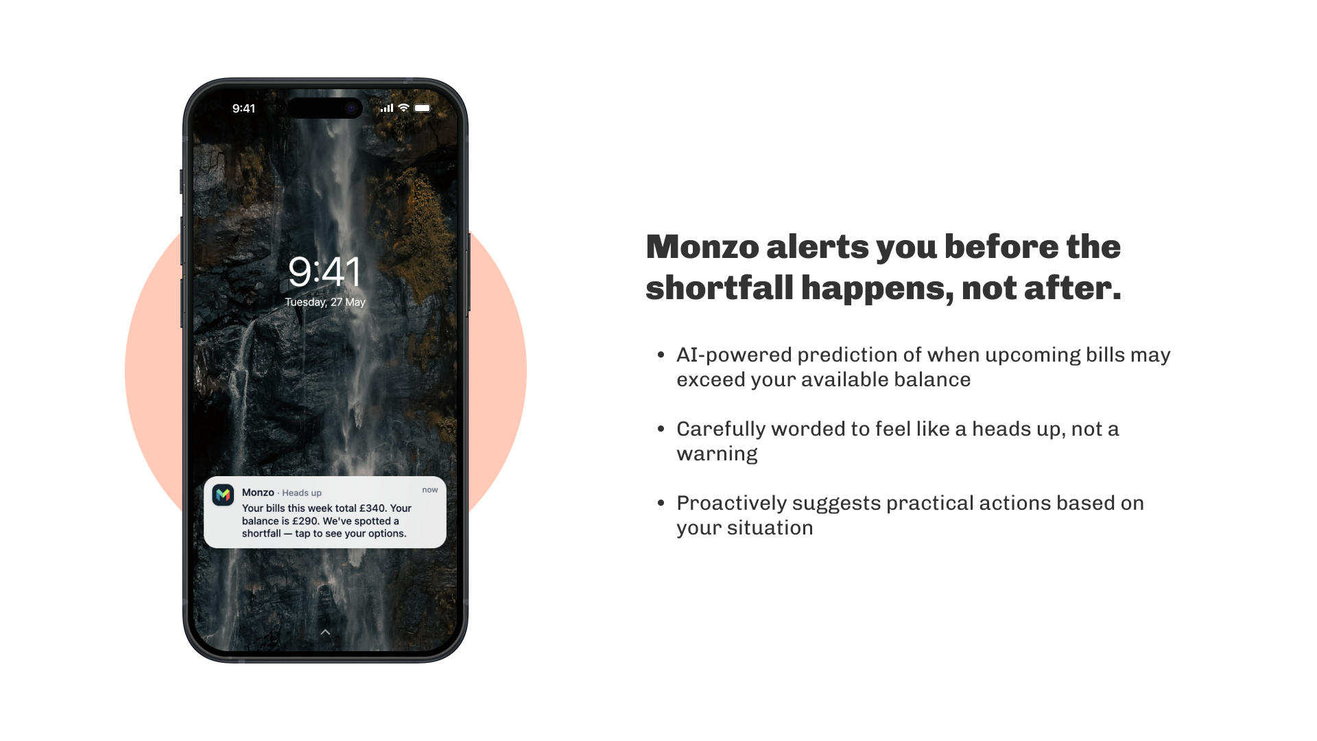
The biggest design challenge wasn't the feature itself, it was the tone. Financial alerts can easily create anxiety if framed negatively rather than supportively.
We rooted the language in Monzo's tone of voice: warm, direct, and never clinical. Our design principles reflected this:
| Principle | In practice |
|---|---|
| Reduce stress | Risk surfaced early, framed as a heads up not an alarm |
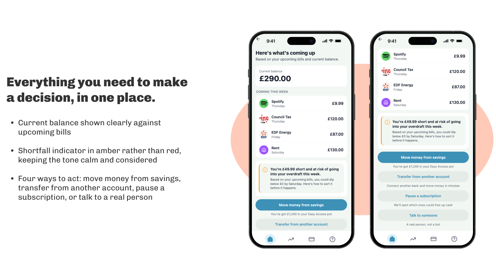
| Create clarity | Bills, balance and shortfall shown together in plain language |
| Support action | Every screen ends with a realistic, concrete next step |
| Feel human | Warm, approachable copy rooted in Monzo's tone of voice |
Final designs
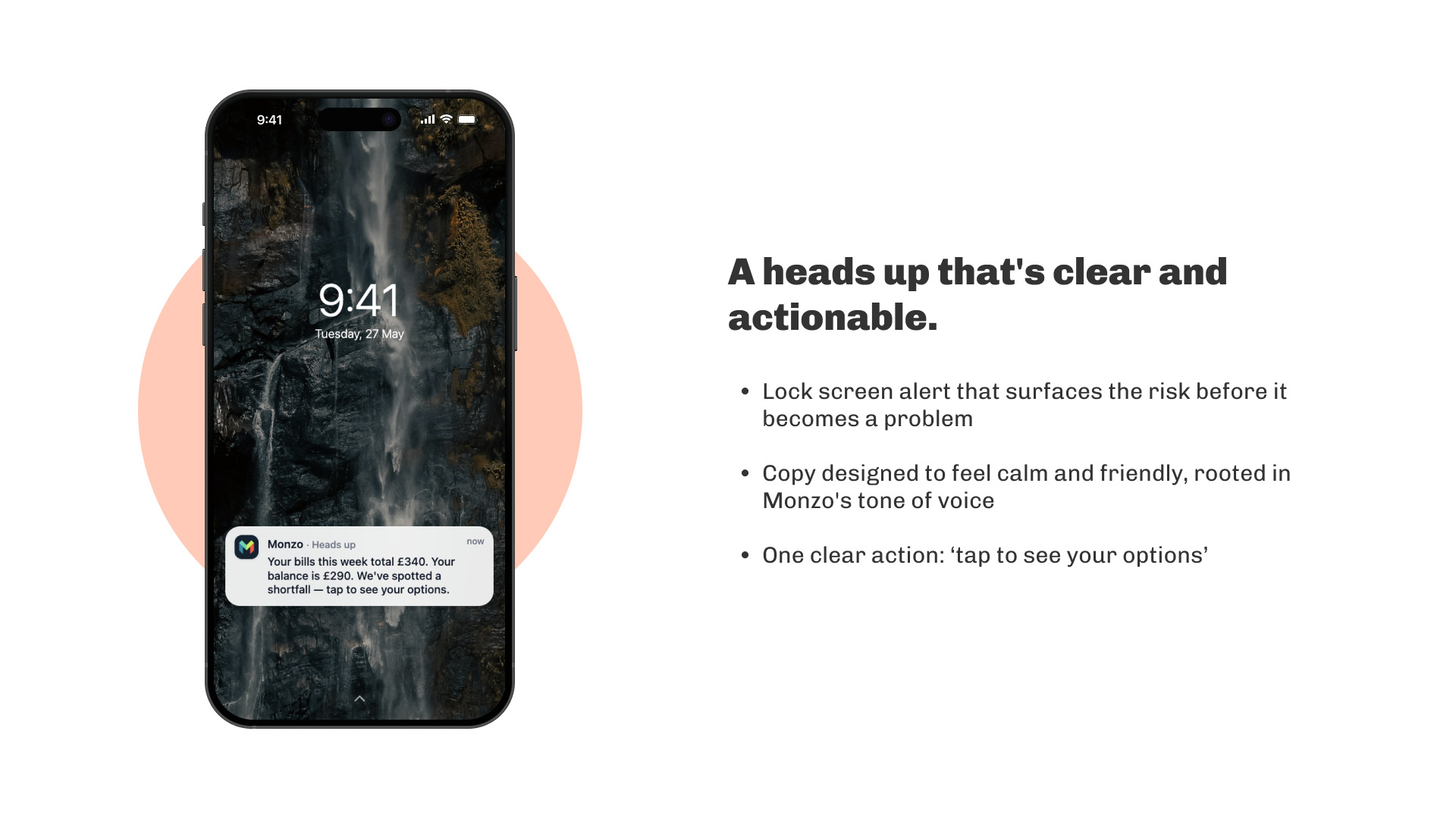
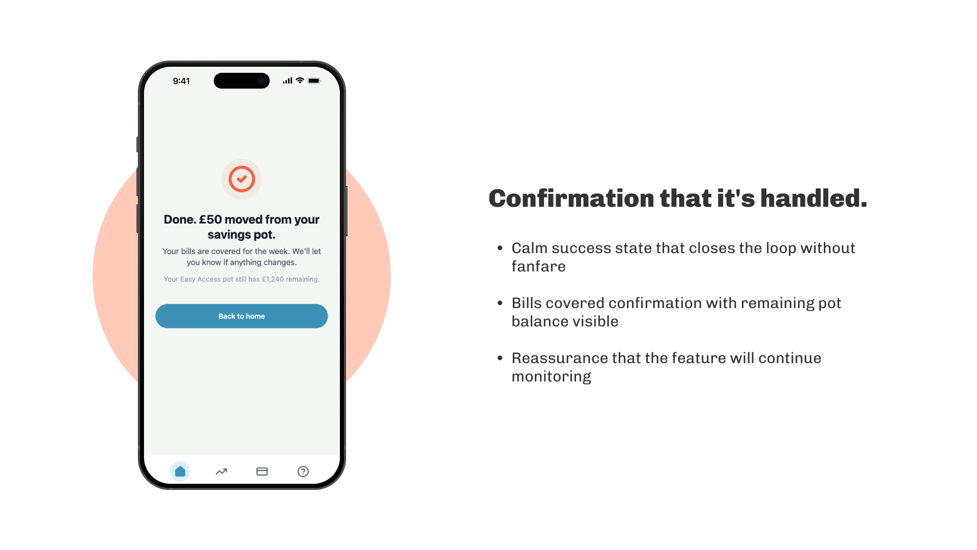
Three screens. One moment. Designed to feel calm and considered.
All three screens were built and iterated in Figma Make, with prompts refined in real time as the design evolved.
PROTOTYPE
The flow, from notification through to confirmation.
EARLY feedback
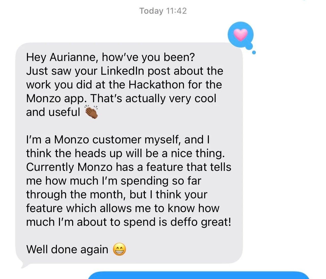
After sharing the concept on LinkedIn, a friend who uses Monzo messaged me saying they could immediately picture themselves using the feature.
“Your feature which allows me to know how much I’m about to spend is great!”
It was encouraging to see them articulate the core value of the feature in their own words: the distinction between knowing what you've spent and knowing what you're about to spend. A strong early signal that the problem is real and the concept is legible.
Reflections
What I learned, and what I'd do differently.
Financial products are emotional products. The most valuable insight from this project was recognising how closely financial wellbeing and emotional wellbeing are connected. Good banking experiences don't just provide information. They reduce uncertainty and help people feel more in control.
Designing for trust requires transparency. If AI is making recommendations about someone's money, users need to understand why. Transparency became just as important as accuracy.
AI tools change what's possible under constraint. Using Figma Make meant design decisions and prototypes evolved simultaneously rather than sequentially. It fundamentally changed how we worked under tight time constraints.
I'd validate the concept with customers. Given more time, I would test the experience with real users and explore how the feature could expand to incorporate salary awareness and open banking data from other accounts.
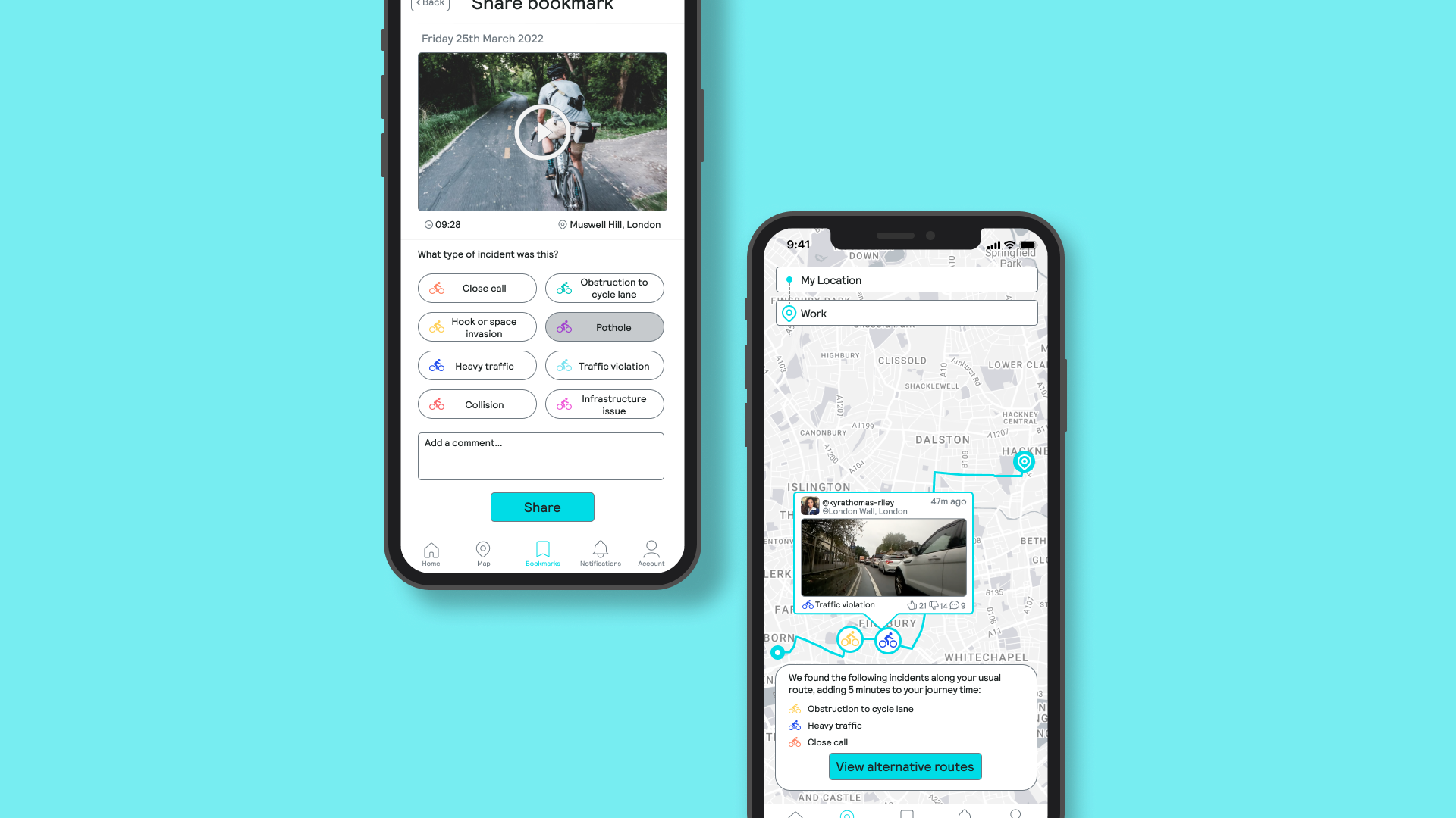
Onsee: An end-to-end design process for a safety and navigation focused cycling app.
Thank you for reading! Click on a case study to view another 🚀
⇔
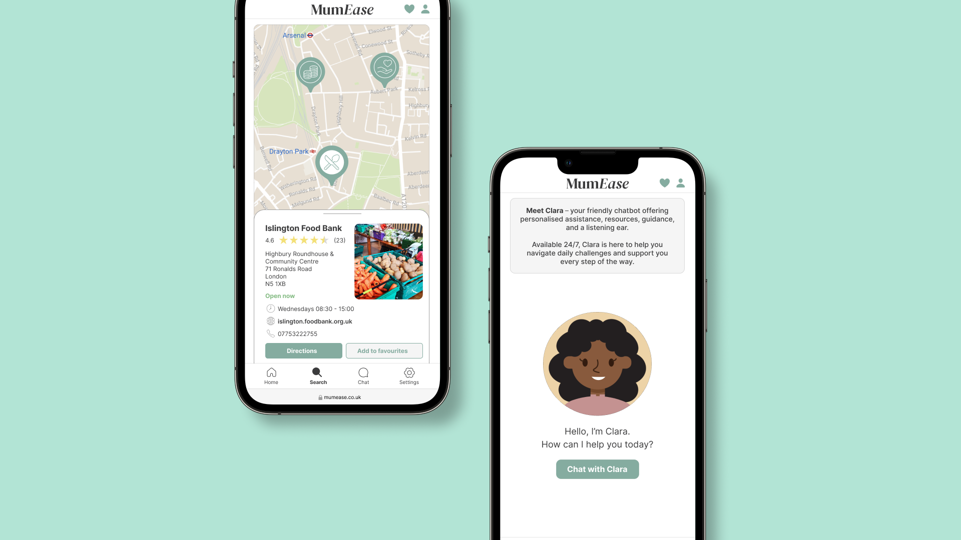
MumEase: Innovating a digital solution that supports single mothers living in poverty.