
Overview
Onsee is a cycle technology company helping urban cyclists navigate more safely, and building the data infrastructure to make cities better for cycling.
Their product ecosystem pairs a mobile app with REBO, a smart bike light and dashcam. Riders capture incident footage automatically; that footage feeds a shared map of problem areas, giving cyclists safer routes and giving councils the data to act on them.
My role
Sole Product Designer (research, ideation, testing, prototyping, stakeholder comms)
METHODS
Stakeholder interviews · Screener survey · User interviews · Affinity mapping · Usability testing · Prototyping
Tools
Figma · Miro · Notion · Pen + paper
The problem
Incident data exists. It just doesn't go anywhere useful.
Cyclists capture footage, but reviewing and sharing it is friction-heavy. Reports rarely reach councils. Recurring danger spots go unfixed. There's no centralised tool that connects the cyclist's experience to meaningful infrastructure change.
The solution
Onsee closes the gap between incident and action.


Stakeholder interviews
The co-founders' vision shaped the design brief.
Two founding interviews gave me a clear north star: build daily habits around safety, not just one-off incident reporting. Success, to them, meant cyclists feeling genuinely supported by a community, and that community's data feeding into real infrastructure decisions, starting in London.
Competitor analysis
Existing tools are fragmented. None close the full loop.
Direct competitors map incidents but fall short on automation. Cyclestreets is web-only, and neither offers seamless footage capture. Indirect competitors like Strava, Komoot and Waze each solve part of the problem, but not for urban cyclists navigating safety in real time.
| Product | Type | Incident map | Mobile | Auto footage | Community feed | Route planning | Key takeaway |
|---|---|---|---|---|---|---|---|
| Bikemap | Direct | Partial | ✓ | ✕ | ✕ | Partial | Manual reporting, no footage integration |
| Cyclestreets | Direct | ✓ | Web only | ✕ | ✕ | ✓ | Web-only; no real-time or social layer |
| Strava | Indirect | ✕ | ✓ | ✕ | ✓ | Leisure | Strong community model; no safety layer |
| Komoot | Indirect | ✕ | ✓ | ✕ | Partial | ✓ | Good route UX patterns; leisure-focused |
| Waze | Indirect | ✓ | ✓ | ✕ | ✓ | ✓ | Closest model to Onsee, built for drivers |
| Onsee | Direct | ✓ | ✓ | ✓ | ✓ | ✓ | End-to-end: capture, share, navigate |
Screener survey
46 responses across cycling communities and forums.
The survey helped identify target users and understand their behaviours and habits at scale.
18 – 24
56%
25 – 34
13%
35 – 44
20%
45 – 54
9%
Under 18
2%
Daily
48%
Weekly
37%
Monthly
11%
Few times a year
4%
74%
feel that footage from cycling incidents is not currently used effectively
66%
do not currently use any cycling specific apps
78%
are interested in an app that uses data to help plan their routes
User interviews
Interviews focused on cycling habits, dash cam attitudes, incident experiences and existing app use. Hearing directly from cyclists made it clear that the frustration wasn't just with safety itself, it was with how invisible and unactionable the data from incidents felt.
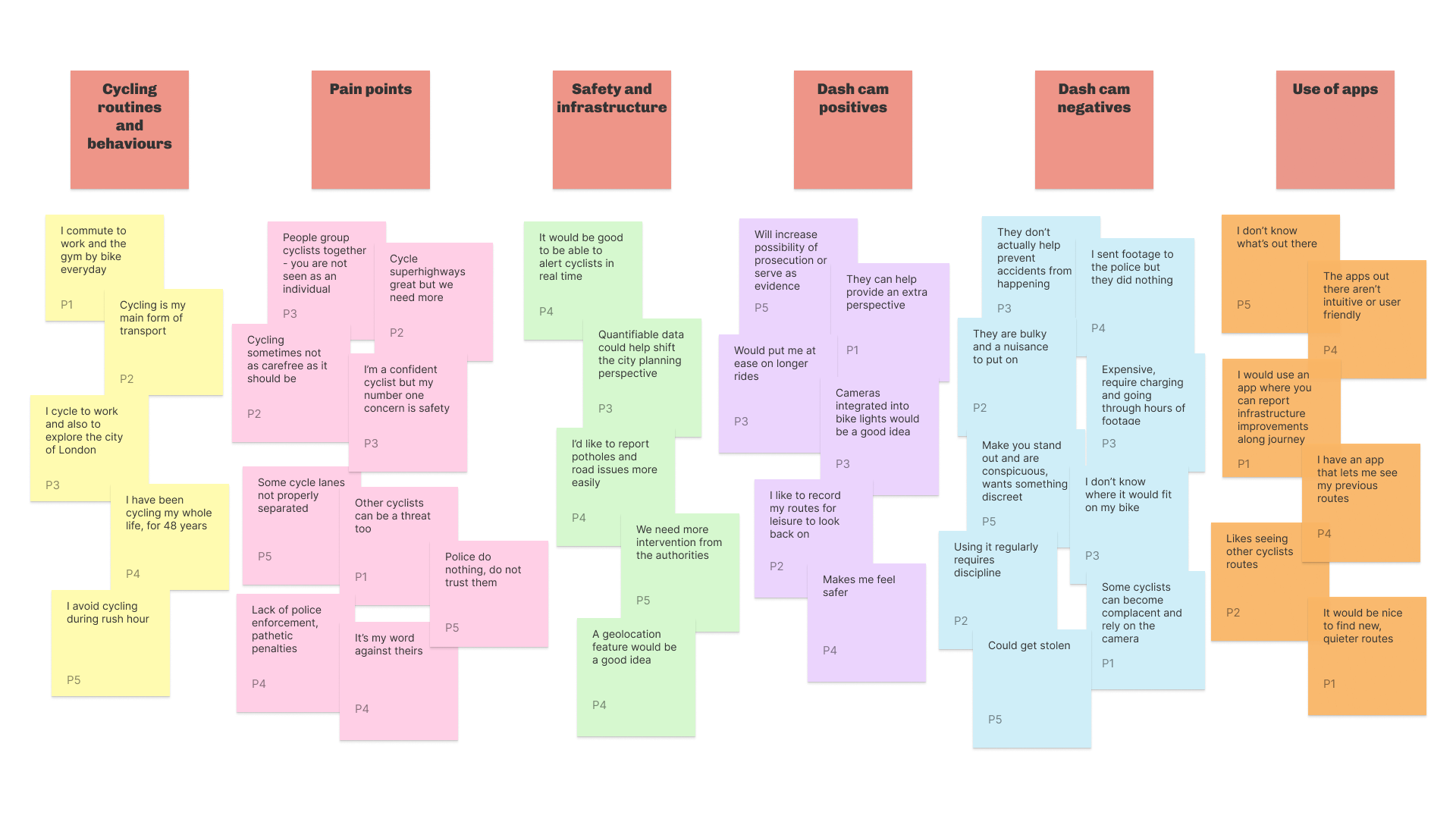
In-depth user interviews uncovered 4 recurring themes.
| Theme | Insight |
|---|---|
| Broken workflows | Reviewing and sharing footage is time-consuming and manual |
| Systemic distrust | Users feel reports to police go nowhere |
| Technology friction | Dash cam reliability and setup is a barrier |
| Untapped opportunity | Low awareness of cycling apps, but high openness to a better one |
PERSONAS & USER STORIES
Two users. One product. Very different needs.

Zachary Allen
I want to be able to see incidents in real time
Goals
- Feel safer when cycling
- More cyclist-friendly infrastructure
- Feel part of a wider cycling community
Pain points
- Doesn't know where incident areas are
- Careless drivers
- Dissatisfaction with lack of police enforcement

Franklin Owusu-Antwi
If the data was in one place, it would be easier to understand
Goals
- Understand cycling issues better
- Know which cycle lanes need improving
- Secure more funding for infrastructure
Pain points
- Navigating complaints from motorists and cyclists
- Lack of useful, actionable data
- Dissatisfaction from his community
journey map
From incident to advocacy.
Mapping the cyclist experience revealed key friction points and opportunities across the journey.
Cycling |
Incident |
Using REBO |
Using Onsee |
Advocacy |
|
|---|---|---|---|---|---|
| Actions | Leaves home to commute to work. | Encounters a close call or incident. | Presses bookmark button on REBO immediately after the incident. | Reviews captured bookmark in the app and shares to feed with incident details. | Returns to Onsee regularly and recommends it to other cyclists. |
| Thoughts | "I hope today's commute is uneventful." | "I need to report this but I don't know how." | "I didn't have to stop or edit anything." | "Sharing this might actually help someone avoid that spot." | "I'd recommend this to anyone who cycles in the city." |
| Emotions |
hopeful
frustrated
impressed
content
satisfied
|
||||
| Opportunities |
Surface incident hotspots on the route preview before the journey starts |
Trigger an in-app notification when a new bookmark is ready to review |
Streamline the share flow to three steps maximum Show engagement notifications so users see the impact of their uploads |
Introduce a refer-a-friend feature to grow the community dataset Prompt users to leave a review after consistent use |
|
HOW MIGHT WE?
How might we make incident footage more accessible and actionable, to help cyclists navigate safely, build community trust and inform urban planning?
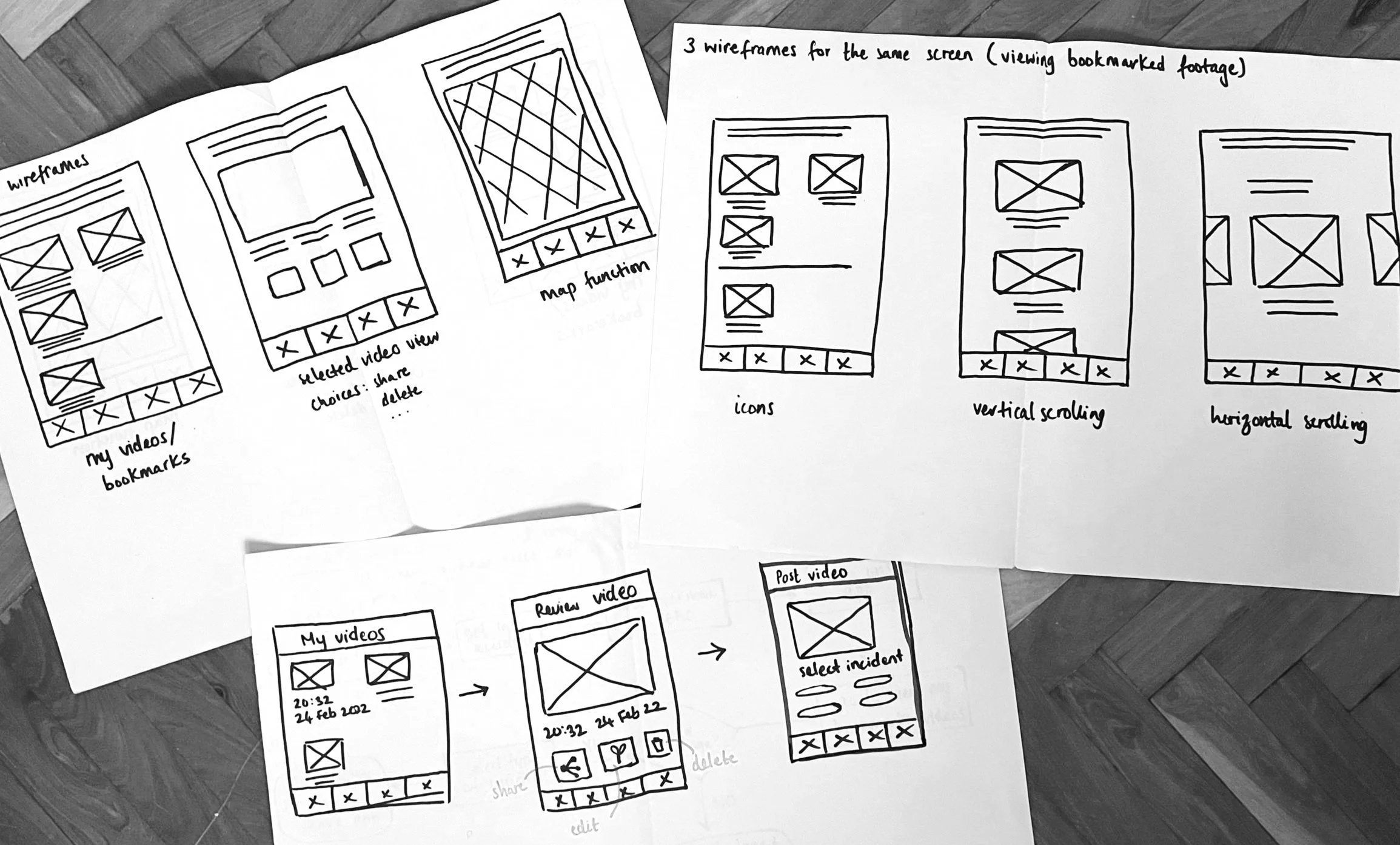
Initial Design
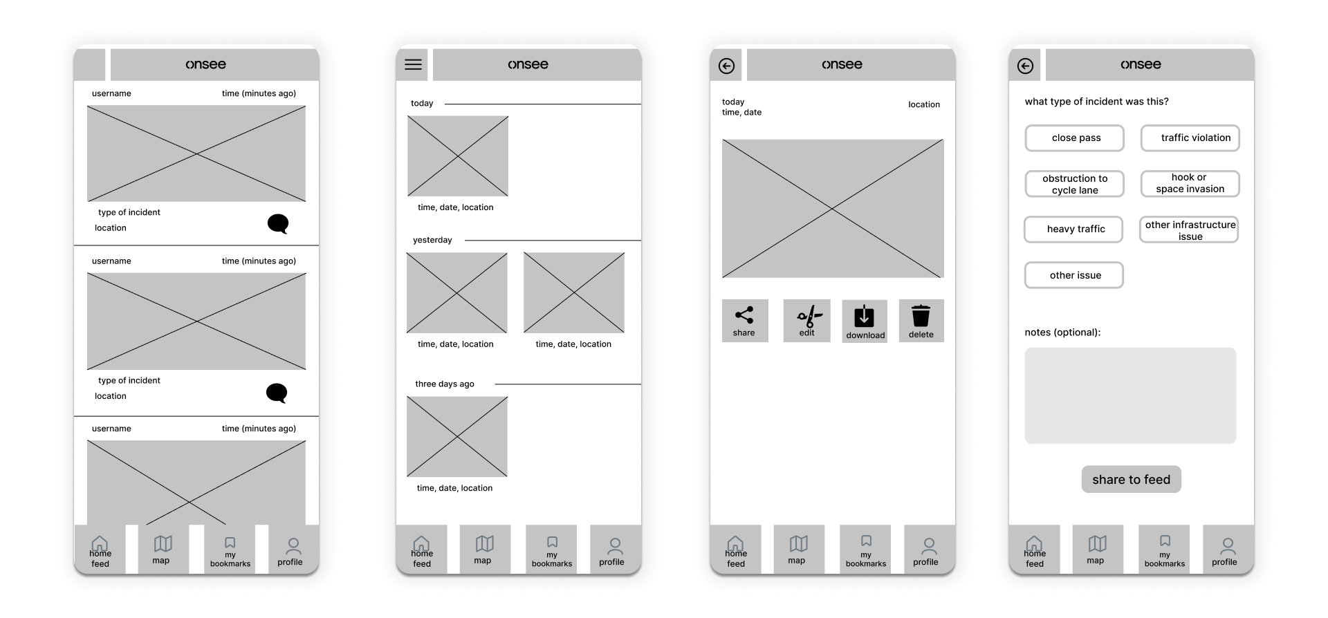
Paper wireframes to mid-fidelity to testing to high-fidelity.
Starting on paper kept the focus on structure and flow before committing to screens. It also made it easier to have honest conversations with stakeholders early, before any visual decisions had been made.
Usability testing
8 users. Interactive mid-fi prototype. Here's what changed.
Testing confirmed the core flows were intuitive. Users navigated independently and completed tasks without prompting. But three gaps emerged that shaped the final design.
| Feedback | Design Decision |
|---|---|
| No way to filter the home feed | Added filters by distance, incident type, and engagement |
| Users missed new bookmarks | Introduced in-app notifications prompting users to review bookmarks |
| No visibility on post engagement | Added a notifications page showing interactions with user uploads |
Final Designs
Onsee’s design system includes established brand colours and typography.
Primary colours
Urban Black
#1E2424
Urban Grey
#707A82
Accent Cyan
#00DCE6
Urban Light Grey
#F4F4F4
Secondary colours
Night Mode Navy
#00182E
Close Call Orange
#FF8464
Hazardous Yellow
#FFD058
Dangerous Red
#FA666A
Safety Green
#00C6BC
Typography — Relative
H1
Heading 1
H2
Heading 2
H3
Heading 3
H4
Heading 4
Body
The quick brown fox jumps over the lazy dog.
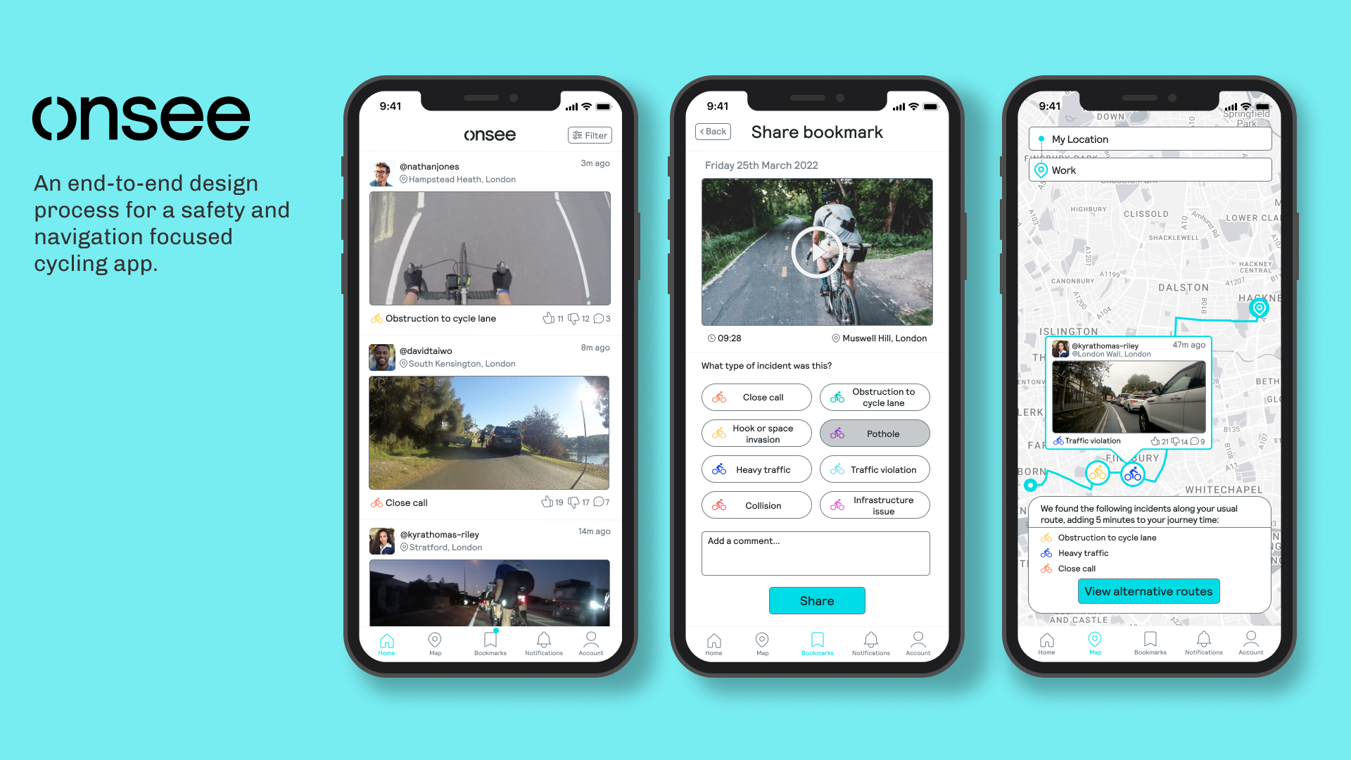
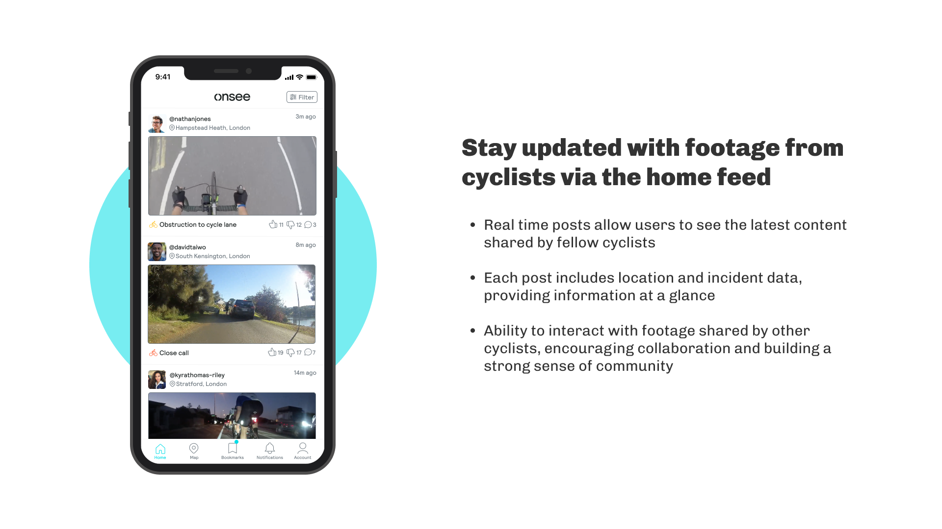
The finished product.
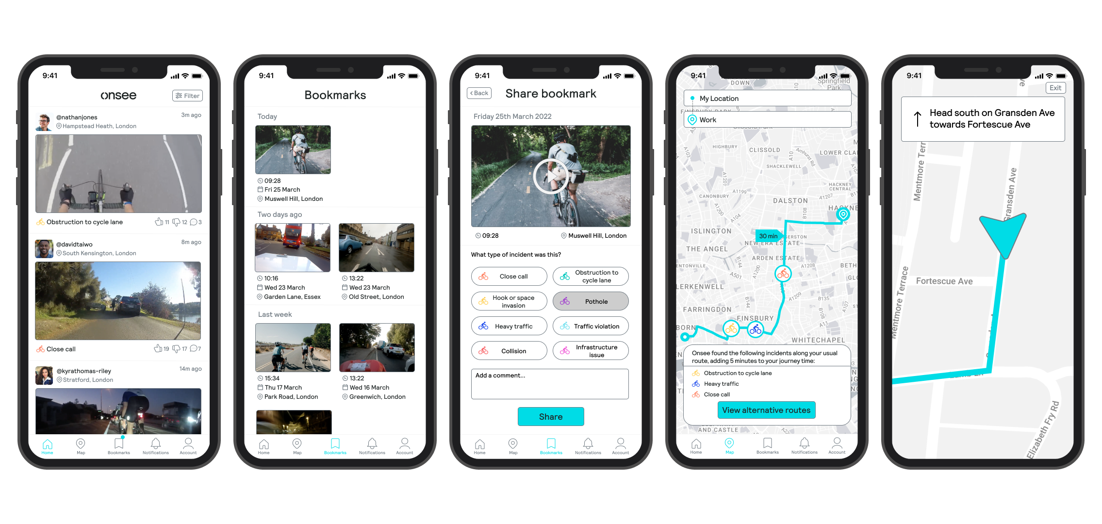
Reviewing a bookmark and sharing it to the feed
Finding a cycling route with fewer obstructions
Switching to night mode for low-light environments
Stakeholder testimonial

You did brilliantly and met the objectives of the brief very well. It was a pleasure working with you!
Crispian Poon
Co-Founder & Director, Onsee
Reflections
What I learned, and what I'd do differently.
Indirect competitors taught me more than direct ones. Waze doesn't target cyclists, but it solves the same core loop: community-reported incidents shaping navigation. Studying it gave me a different lens for thinking about Onsee's feed design, and reminded me that useful inspiration often comes from outside your immediate space.
Testing mid-fi prototypes early was worth it. Three features in the final product came directly from usability feedback. Getting that critique before high-fidelity work meant changes were faster and more time efficient, and the designs were genuinely better for it.
I would go further with testing. The biggest limitation of this project was stopping after one round. If I returned to it, I'd run a second round after high-fidelity and track whether the design changes actually improved task completion, not just how users felt about them.
I'd explore the hardware/software relationship more. A lot of the design assumed the REBO and app handoff would work seamlessly, but in reality the connection between a physical device and a mobile app involves friction points I didn't fully design around. That deserved more attention.
MumEase: Innovating a digital solution that supports single mothers living in poverty.
Thank you for reading! Click on a case study to view another 🚀
⇔
Monzo Money Intelligence: Designing a proactive banking experience that gets ahead of financial stress.